UX Copywriter portfolioUsability (UX Thinking)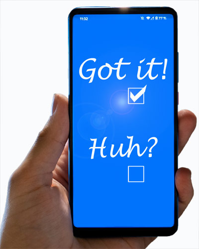
How to improve Usability — the User ExperienceBelow are examples of good Usability, and how to correct Usability errors. Frankly, the errors are so obvious and the solutions so simple that they hardly seem worth mentioning. But sometimes that's the problem. Things seem obvious ... except to the first-time user. There may be other reasons. Many UX design errors exist because ...
But sometimes fixing it just doesn't seem important. Well, it is important. It merely takes a UX Thinker. And it's usually not hard to fix.
Color KeysSITUATION: 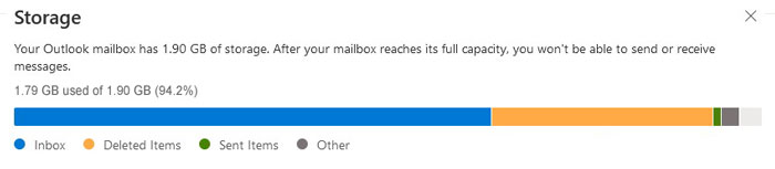
RESULT: After removing all Deleted emails, the bar (below) shows lots more headroom in Storage. But ... 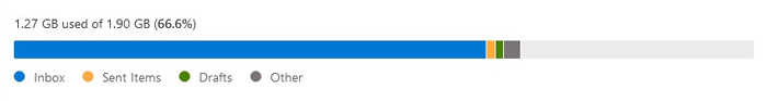
ISSUE: SOLUTION: 
NOTE: Register/LoginSITUATION: 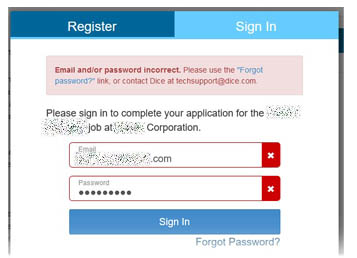
RESULT: User Sign-in fails, producing error message. ISSUE: SOLUTION: NOTE: Form HintSITUATION: RESULT: Entry looks complete and correct, but isn't, producing mysterious error message. ISSUE: SOLUTION: NOTE: CourtesySITUATION: RESULT: User must revise the text, perhaps entirely. 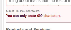
ISSUE: SOLUTION: NOTE: And a personal peeve: The "misplaced only." The word "only" belongs next to the word it modifies. (It should be "You can enter only 600 characters." Technically, putting it before "enter" means you can only enter characters, you can't revise them, etc.) But I hear or see it placed correctly only a few times a year, and have given up on this issue. As long as people understand, that's sufficient. After all, comprehension is at the heart of UX Thinking. FormsSITUATION: RESULT:
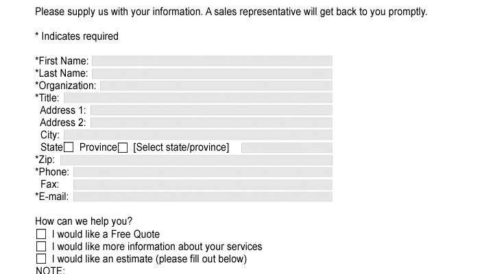
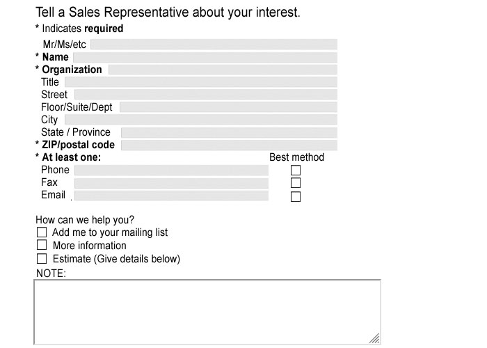
Let's ask for everything? ISSUE: SOLUTION: NOTE:
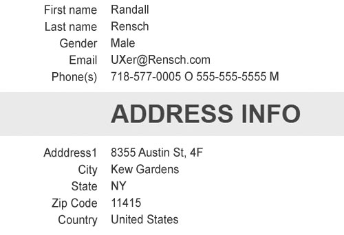
FlowSITUATION: RESULT: This step isn't "wrong," but it is inefficient, and annoying. ISSUE: SOLUTION: NOTE: Data DisplaySITUATION: RESULT:
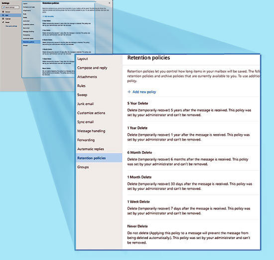
Display is awkward for reader to read and to use. ISSUE: SOLUTION: NOTE: PlanningSITUATION: RESULT: None of these policies are clickable, and the Add New Policy link produces a blank page that also does nothing. ISSUE: SOLUTION:
I also frequently post informative, supportive, and other comments on Facebook, etc., sometimes receiving thanks and hundreds of "likes." These pages are also UX and web-related: You can also interactively search for UX among my Samples.
For more details, Do you have a project, question, or suggestion in mind? Let's put our minds together.
|